Five Tips you should know about your Photoshop Designs career
The internet is awash with articles claiming to offer Photoshop editing “tricks,” as if by the revelation of some secret insider knowledge our mediocre snapshots will be instantly transformed into photographic masterpieces. But if by tricks we mean easy shortcuts, there aren’t really any Photoshop tricks.
Photoshop is a powerful tool. To get the most out of it, you’ll need to learn how to use it properly. It’s not a case of pressing some secret combination of keys and your photos will immediately look great with no effort at all. As with most things in life, good results require a little hard work.
Having said that, though, Photoshop is actually pretty simple to learn. And once you’ve acquired a few key skills, you can easily adapt these and apply them in many different photo editing situations.
So, no, this article doesn’t contain any magic editing solutions or great retouching secrets. Instead, what you’ll find below are 5 simple Photoshop techniques for improving your photos. Techniques that you can – and indeed, should – use again and again.
5 simple Photoshop editing techniques to improve your photos
1. Shoot RAW, process for more
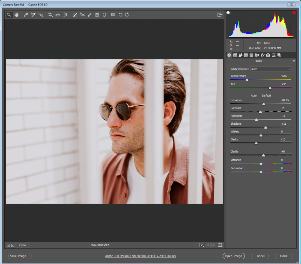
With the exception of smartphones, most modern cameras allow users to shoot their photos in high-resolution RAW format. If your camera permits this, then you should certainly do so, as it will give you greater information to work with when it comes to editing.
The thing is, though, if you don’t conserve all that information when you open your RAW files, then there’s not much point in shooting RAW in the first place. Conserving the info means keeping your extracted RAW files relatively neutral.
Sure, it helps to have an idea of what you want to do with a photo when you open it in Photoshop’s Camera Raw. However, at this point the goal is not to process the photo too far towards your final goal, but rather to extract the most versatile and information-rich file possible. This will provide you with a good solid base from which to begin working.
For example, if you were ultimately aiming for a gritty and low-key documentary-style shot, it might be tempting to push the image in this direction when extracting the RAW – for example, by ramping up the contrast, desaturating the colors, and reducing overall brightness. This would be a mistake, though, as it would leave you with a seriously impoverished file right from the outset, with no way of going back beyond just starting over with the RAW file.
Better to keep all options open by processing your RAW files for the widest exposure latitude possible and with relatively neutral color settings. This way, even if you’ve already decided that you’re going for a stark and crunched photojournalistic vibe, all the info is still there in the file in case you need it.
2. Layer For effect(s)
If you’re not already working with Adjustment Layers, you should be. Adjustment Layers sit on top of the background image, allowing you to make changes to things like contrast, color balance, saturation and exposure, without destructively altering the original file underneath. This gives you much greater flexibility to go back and tweak edits, or apply them selectively to only specific parts of the image.
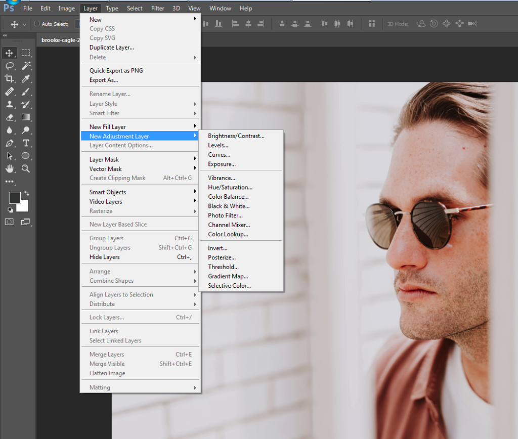
Next time you need to make edits to a photo, rather than going to Image > Adjustments, choose instead Layer > New Adjustment Layer and select the required adjustment from the menu there.
3. Get with the curves
Use of the Curves adjustment is very definitely not a “trick” but rather a standard tool in any serious photographer’s photo editing kitbag. The Curves panel tends to freak a lot of people out the first time they use it; typically they’ll touch one end of the curve and the rest will go haywire, sending their photo into hyper-solarization or some similarly horrific result. For many, experimentation with curves ends there.
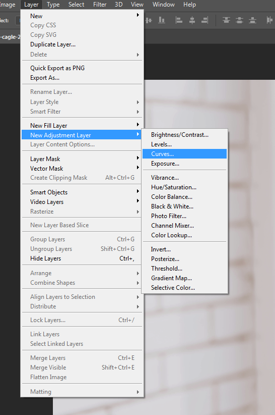
If this is you, it’s time to get over your trauma. The Curves panel is the correct way to edit brightness and contrast, permitting much greater control than the dedicated Brightness/Contrast adjustment panel will allow. Take a deep breath, steady your trembling hand, and go to Layer > New Adjustment Layer > Curves.
You’ll see the Curves adjustments panel: a graph with a diagonal line, rising from left to right. The bottom left represents the deepest blacks and shadow areas of your image. On the top right are the extreme highlights. In between lies the full range of shades present in your image file.
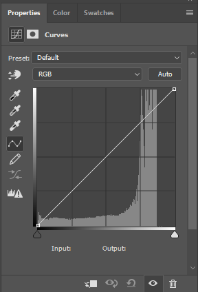
Click somewhere on the line; around the middle to make things simple for now. Drag it upwards and you’ll see the image become lighter. Go down for darkness.

Now see what happens if you move the line upward in the middle again, and then shift the peak of the curve either left or right. As we already said, by moving the curve upward you make that part of the tonal spectrum lighter. In this case, with the peak in the middle of the line, we’ve adjusted the mid-tones. Keeping the curve raised while moving the peak of the curve to, say, the left will continue to lighten the image; it’s just that now it will lighten more in a different tonal region. As you move the peak away from the center, going slightly to the left, it’s now primarily the upper-midtones that become lighter.
However, due to the smooth and even way that a simple curve like this adjusts the image, although we’re making our curve adjustment closer to the left now in order to alter the upper-mids, you’ll see that the shadows also change along with highlight areas. Go further to the left still, and the highlights receive even more of the adjustment now. Notice, though, that the peak of the curve is not precisely where we’ve clicked on the line, but remains a little to the right.
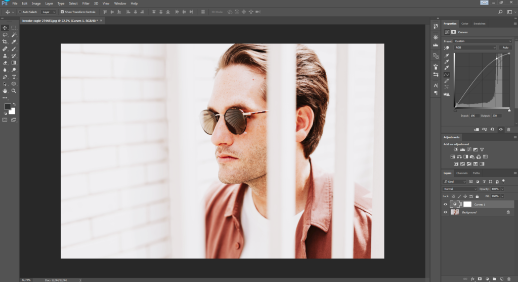
The rounded shape of the curve means that we won’t end up doing any strange or unnatural things to our image as we adjust its density.
However, there are times when we might want to adjust one specific tonal area without changing the brightness of the others. By clicking another position on the curves line, you can create a second anchor point so that your first adjustment will stay locked in place even when you move another point on the line.
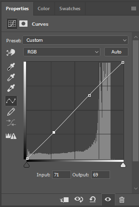
This allows you to easily lighten and darken different regions of the tonal scale independently of one another, without your curves flying off the scale like an athlete’s cardiograph.
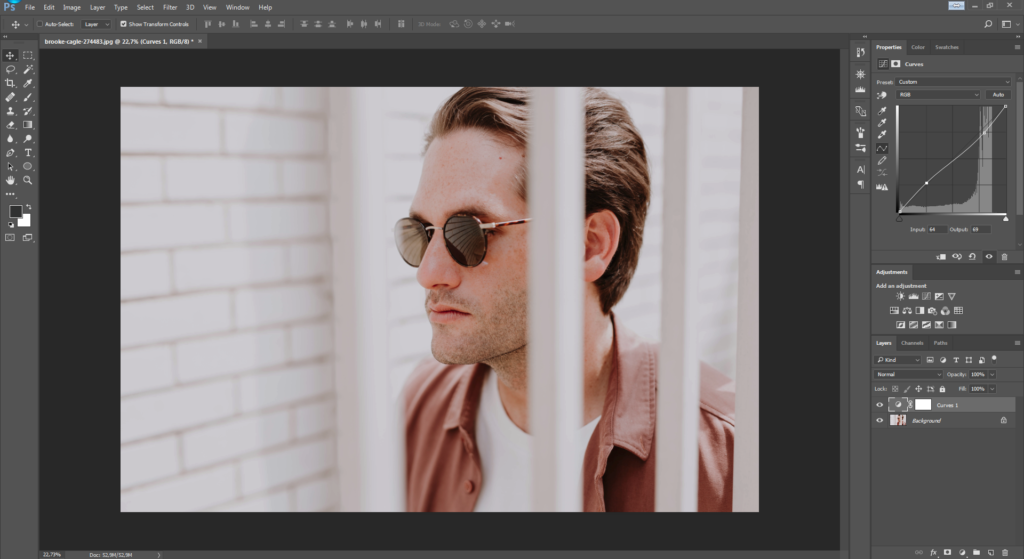
This is particularly handy for adjusting contrast with a high degree of precision. For example, shadow areas can be lightened at the same as highlights are toned down, giving a subdued, low-contrast look, as demonstrated in the image above.

A word of caution: If you’re not careful when using multiple anchor points, things can start to get weird pretty quickly. For example, push the peak of the curve too far and you’ll end up with the impossible scenario of having shadow areas lighter than your highlights. (Similarly, if you darken the highlights too much, the exact opposite happens.) This is what causes solarization… generally an effect you’ll want to avoid.
The first rule, then, is never to push the curves too far. For a simple curves adjustment, such as lightening or darkening an image overall, just raise or drop the curves line in a wide and even arc with a single anchor point. Now, by shifting the peak of the curve left or right as desired, you can determine precisely how this adjustment to brightness will effect your image.
For more local adjustments of specific tonal areas, use two or more anchor points to change the density in one area without effecting the others.
The Brightness/Contrast panel doesn’t permit anywhere near this degree of control, so once you’ve become comfortable with adjusting the Curves, you’re unlikely to ever go back.
4. Better dead than red
Some “white” skin is more pink than anything. Too long under the sun (or propping up the bar) and that pink can quickly turn into full-blown crimson. Not a great look. So what can you do if your subject comes out looking like Rudolph the Reindeer?
The obvious thing to do here is just reach for the Color Balance controls and reduce the amount of red in the image overall. The problem is that there will likely be other areas of the photo with red in them that we want to keep red. For example, in our photo the guy is wearing a nice red shirt that needs to stay that way. How do we get around this?
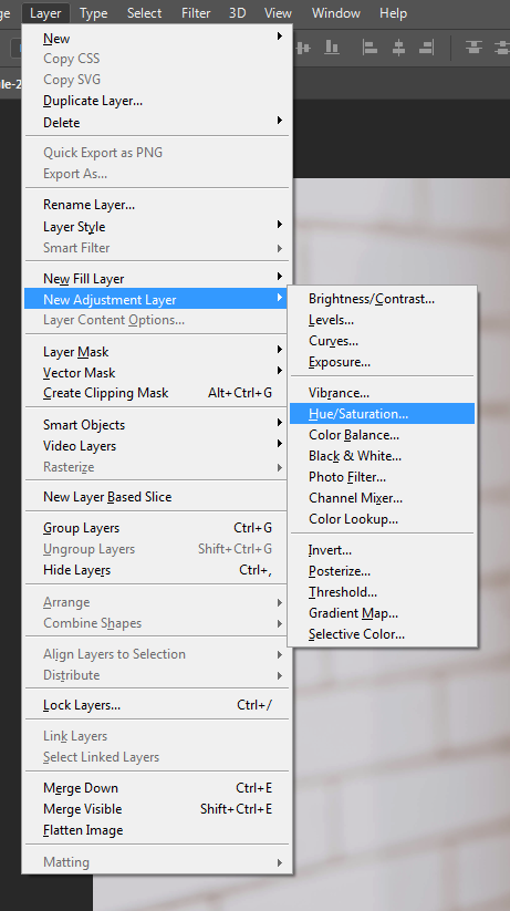
No big deal: create a new saturation Adjustment Layer by going to Layer > New Adjustment Layer > Hue/Saturation (see above) and changing the layer’s settings from Master to Reds on the drop-down menu.
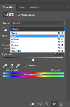
Now any changes you make here will only effect the red areas of the image. Play with the saturation, lightness, and maybe even hue sliders, until the offending red area is closer to the rest of the subject’s skin tone, and then fill the entire Adjustment Layer with black, or hit Ctrl+Backspace (Mac Alt+Backspace) to mask the effects of the Adjustment Layer.
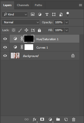
Now grab the Paint Brush tool, and carefully paint over the worst-affected red areas with white to reveal the effect of the desaturated Adjustment Layer again, but only in these specific areas.
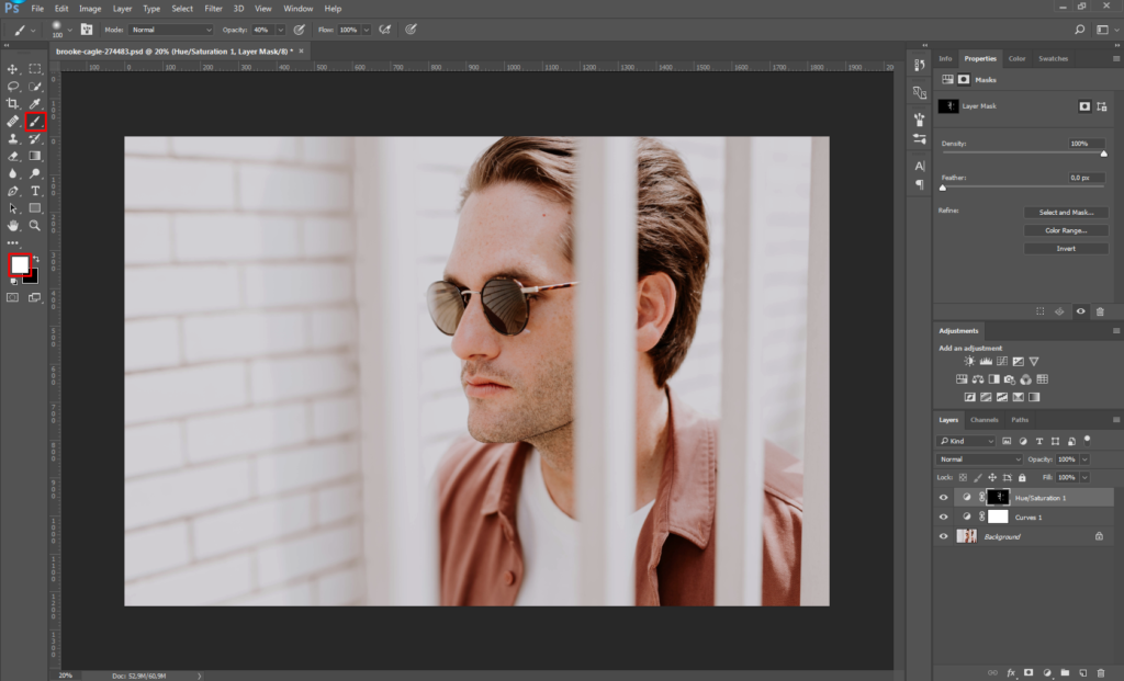
For example, in the image above, notice how the unsightly redness in the model’s skin on his nose, ears and eyes has been totally removed (without altering the tone of his shirt or other red areas) by erasing the mask over the desaturation Adjustment Layer only in these regions. If necessary, you can now go back to the adjustment panel and tweak the level of desaturation again until things look completely natural. (Let’s be honest: A totally gray nose won’t look much better than a bright red one.)
Depending on skin tone, lighting conditions, camera sensor, and other factors, your subject’s bulbous “red” nose might be more magenta than anything, though. So if the above steps don’t seem to make much difference, you can try repeating the process, but this time changing the magentas rather than the reds.
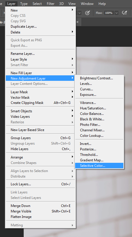
You can also go to Layer > New Adjustment Layer > Selective Color and alter the precise shade of the reds or magentas in this way, too (for example, by adding more yellow or cyan). Again, you’ll then need to mask the entire Adjustment Layer with black before painting it back in just where needed using white.
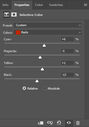
Naturally, this technique isn’t restricted only to fixing problems with red or magenta. It can be a great solution for toning down distracting marks, patches, or other imperfections in any color range you need – whether on human skin, eyes, clothing, or the walls of a room.
5. Quick layer composite
Yeah, yeah, we said there aren’t any Photoshop “tricks.” But to finish off, here’s the exception that proves that rule.
Let’s say you’ve got a lot of layers on your photo, and you need to make an adjustment to all of them at once… but still with the ability to go back and edit those layers separately later. What’s the solution? Make a copy of each layer one by one and then flatten these copies into a single layer?
Well, yes and no. In practice, that’s exactly what you need to do. However, there’s a shortcut: Instantly make a composite layer combining all open layers by pressing Shift+Ctrl+Alt+E (for Mac, Shift+Cmd+Option+E).
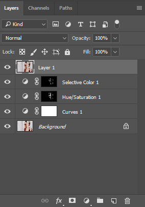
Now you can edit the composite without losing your original layers or going through the hassle of duplicating them all. Don’t forget to first switch off any layers you don’t want included in the composite.
Now it’s over to you
Skillful editing with Photoshop is all about finding clever workarounds for the unique challenges that come with each new photograph. Having a clear vision of where you want to take a photo when you start editing will make things easier, but you’ll also need a few basic skills and techniques under your belt before you begin – even if you’ll often find you have to get creative by applying these skills in new and unconventional ways.
The techniques listed above can all be used and adapted depending on your needs in order to fix numerous problems beyond the few we mention here. The only real limit is your imagination!


No comments